“Life is like riding a bicycle, in order to keep your balance you must keep moving.”
– Albert Einstein
If you read my first blog, “What’s In a Name,” you know that the name “Move Your Mission” was conceived while I was out on a training run for Ironman 70.3 North Carolina. In fact, most of my best ideas are formulated during those quiet miles spent by myself training whether it be running, biking or swimming. It was during one of those training sessions that I sketched out in my head what I wanted MYM’s logo, website design, and associated content to look like. I’m finding that my recent clients have an active athletic component whether they use athletics to fundraise or are involved in selling merchandise in this space.
The Barnett Searing National Cancer Foundation and Ironheart Foundation raise much needed dollars through personal fundraising campaigns triathlon and running events. CORE Foundation runs the largest sprint triathlon in Northern Virginia with 1000 athletes and sells out in 24 hours. They also use golf tournaments as a means of fundraising for various causes which give a hand up not a hand out to those in need. Significant dollars are raised in programs for these organizations while athletes are “Racing With Purpose.” Organizations like The Yoga Foundation of Fredericksburg provide yoga services to the underserved as they believe that yoga is for everyone. Working with this type of client feels like family.
When creating MYM’s branding, appealing to these clients and others wanting to move their missions forward showing forward progression in a visual and active way was important. I visualized a circle design because that shape universally represents perfection and wholeness. Taking that one step further, I wanted to use elements that were meaningful to me just as I would advise my clients to do. Given my love of cycling, bicycle parts were an obvious choice. But, using just a bike wheel would have been predictable. I wanted my logo and site to be memorable and unique. So, I chose to make MYM’s logo a circle out of bike chains.
Bike chains need grease. They are sometimes full of grit depending on the ride and conditions. Chains can get stuck between gears. My first triathlon taught me that sometimes chains even fall out of place causing the rider to stop and make adjustments so they can move forward. Business operations can be a lot like a bike chain. They can become crusty and require attention, cleaning, or lubrication.
When working with a client, in the simplest form I encourage them to consider two questions:
What do you want to be when you grow up?
How will you stand out?
My advice is always to choose branding and messaging that represents you and has special meaning. It should have an edge and be striking and memorable. You shouldn’t choose blue and green because you think people like blue and green. Choose blue and green because it speaks to you, and you have a specific, purposeful reason driving that decision. Your logo, website and messaging should excite and energize you. If it doesn’t it certainly won’t excite the community or following that you are trying to attract.
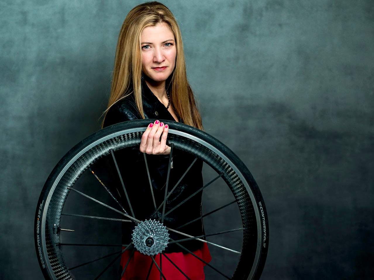
For branding and website, I chose pink and monochromes: greys, black and and white with accents of blue. Those colors excite me! They show my passion and are true to who I am as a leader. The photos we shot for marketing echo this same sentiment. My amazingly talented photographer friend, Gene Wozny, embraced all of my ideas. We went for an edge with the right amount of sass and a bit of badass. We used bike parts and leather elements were possible. This demonstrates edge, and that MYM will aggressively fight for our client’s success.
As they say …your vibe attracts your tribe.
Interesting in learning more about how MYM can help your organization attract the right tribe? Shoot us an email at hello@moveyourmission.com.


